
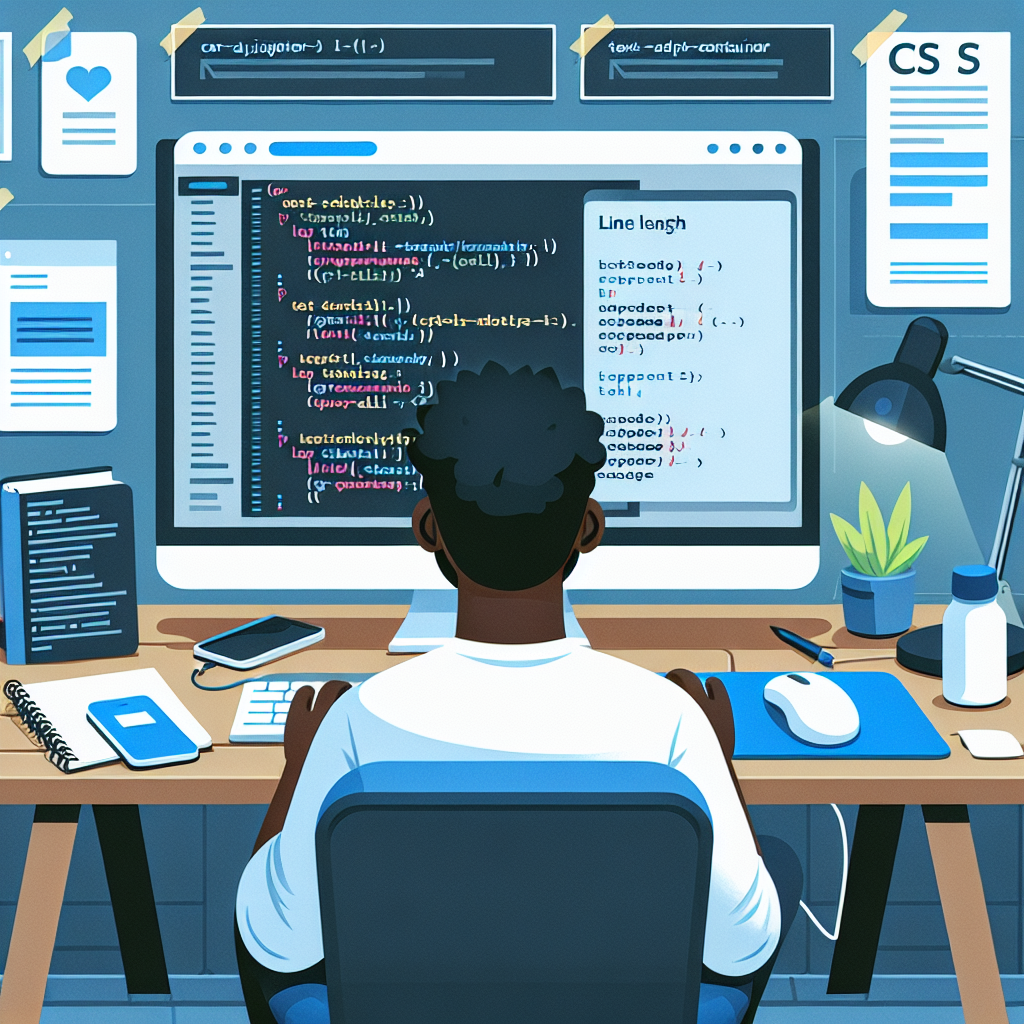
Line length directly affects readability and the reading experience in digital interfaces. Correctly adjusting line measurement helps maintain the reader's attention, reduces cognitive load, and improves text accessibility on both desktop and mobile devices.
As a rule of thumb, a length between 45 and 75 characters per line is recommended, with an ideal value around 66 characters. This measurement avoids lines that are too short, which forces frequent breaks, or too long, which makes it difficult to visually track the beginning of the next line.
In CSS, there are several useful techniques for controlling line length and adapting text to the container. One of the simplest is using the ch unit to limit the width of the text block, for example max-width 65ch to approximate the recommended range. Another technique is combining modern units and functions like clamp for responsive typographic scaling, for example font-size clamp(16px, 1.6vw, 20px), which maintains proper proportions on different screens. To control word breaks and automatic hyphenation, properties such as overflow-wrap break-word, hyphens auto, and word-break normal are used. When looking to fit text to the container without relying on JavaScript, container queries and viewport units offer robust solutions.
In addition to the techniques already available, two conceptual proposals could make the work easier and greatly simplify line length control in CSS. The first proposal is a line-length property that accepts values in characters or adaptive ranges and makes the browser calculate the optimal width of the typographic container without manual calculations. The second proposal is text-fit, a property that combines typographic adjustment and font-size scaling so that content fits cleanly into fluid boxes, applying line balancing rules and automatically avoiding orphans and widows.
In practice, an effective and current solution consists of combining max-width in ch, a comfortable line-height between 1.4 and 1.6, and a responsive font size with clamp. Complement this with overflow-wrap and hyphens to improve breaks, and evaluate the use of container queries to adapt the layout according to the actual available space. If a more precise adjustment is needed, a small script that measures characters per line and adjusts font-size can solve edge cases, but many problems are resolved with current CSS tools.
At Q2BSTUDIO, as a custom software and application development company, we offer solutions that include interface and user experience optimization, integrating typography and responsive design practices. We are specialists in custom software, artificial intelligence, cybersecurity, aws and azure cloud services, business intelligence services, AI for companies, AI agents, and power bi. We design custom applications that consider readability and text adaptation to the container from design to implementation, applying good CSS practices and, when appropriate, AI automations to adapt dynamic content.
If you need your digital product to display clear, readable text on any device, Q2BSTUDIO can help you implement line length control strategies, typographic optimization, and artificial intelligence solutions to adapt content and improve the user experience. Contact our team to evaluate your project and apply custom software, cybersecurity, aws and azure cloud services, business intelligence services, AI agents, and power bi solutions that drive your business.