
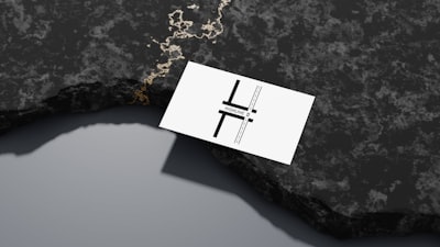
Designing a logo for business cards goes far beyond aesthetics: it is a strategic tool that must communicate your brand essence in a small space. In a world where customer attention lasts seconds, a poorly conceived logo can go unnoticed or, worse, convey the wrong message. That is why this article offers seven practical tips with a technical and business perspective, so your logo not only looks good on paper but also reinforces your business identity. We will also reference technological services such as custom applications, artificial intelligence, cybersecurity, and cloud computing, because in the digital age branding and technology go hand in hand.
1. Define your brand identity before drawingMany entrepreneurs make the mistake of choosing a logo simply because they like it visually, without considering if it reflects their company values. Before opening any design software, ask yourself: what is my business mission? What emotions do I want to awaken in my clients? For example, a cybersecurity company should convey trust and solidity, while an AI startup might opt for more dynamic and futuristic shapes. If you work with a technology development team like Q2BSTUDIO, we know that consistency between the logo and the services you offer (such as cloud AWS/Azure or BI with Power BI) is essential to position yourself in the market. A logo aligned with your value proposition increases brand recall by up to 80%.
2. Bet on simplicity and scalabilityA logo that is too complex will lose details when printed on a 3.5 x 2 inch card. The golden rule is that it must work both in a 16x16 pixel favicon and on a billboard. This means using clean geometric shapes, avoiding excessive gradients, and ensuring sufficient contrast. From a technical perspective, companies that develop custom applications know that scalability is key: just as your software must adapt to different devices, your logo must withstand reductions without losing legibility. If you also use artificial intelligence to generate variants, make sure the final design is vector and can be exported at a minimum of 350 dpi.
3. Color as a recognition toolColor psychology is not a myth: blue conveys professionalism, green association with nature or finance, red urgency or passion. Choose a palette of two or three colors that remains consistent across all your printed and digital materials. In the business realm, a Business Intelligence consulting firm using Power BI might opt for cool tones to suggest objective analysis. Also consider grayscale reproduction: if your logo depends on color to be understood, it will lose impact in photocopies. The cloud AWS/Azure services from Q2BSTUDIO can help you manage visual consistency through digital asset management tools, storing official versions of the logo in the cloud so all departments use the same one.
4. Typography: legibility above allYour logo typography must be clear even at small sizes. Avoid decorative fonts that become illegible below 8 points. Opt for sans-serif fonts for a modern look or serif if you seek tradition. In a process automation project, for instance, a clean font conveys efficiency. If you combine your logo with a tagline, make sure the visual hierarchy is correct: the brand name should stand out more. Remember that typography must also be legible on screen, as your digital business card may be shared via email or social media.
5. Respect dimensions and safe areasThe standard business card size is 85 x 55 mm (approximately 3.35 x 2.17 inches). Your logo should occupy a significant space without overcrowding. Leave a safety margin of at least 3 mm (0.125 inches) around the logo to avoid cuts during printing. If you work with a software development company like Q2BSTUDIO, you can apply the same 'safe area' principle we use in user interface design: critical elements should not be near edges. Also consider orientation: a horizontal card is traditional, but a vertical one can be more striking if your logo allows it. BI with Power BI solutions will help you analyze which design generates more engagement among your clients by tracking interactions.
6. Test your logo in different contextsDo not rely only on the screen preview. Print prototypes on matte, glossy, and textured paper. Test the logo on dark and light backgrounds. Also evaluate how it looks on mobile devices, your website, and social media profiles. Companies that integrate cybersecurity into their processes know that brand security also involves preventing fraud: a low-resolution logo can be easily counterfeited. Q2BSTUDIO offers pentesting services to verify that your digital assets are not vulnerable, and AI agents can generate multiple logo variants to test with audiences before deciding on the final version. Real customer feedback is irreplaceable.
7. Maintain consistency across all channelsOnce the logo is defined, use it consistently on cards, website, email marketing, invoices, uniforms, etc. Inconsistency confuses the customer. If you have an international presence, ensure the logo adapts to different languages without losing its essence. Companies that develop custom applications with Q2BSTUDIO know that integrating AI APIs can help you automatically validate chromatic and typographic consistency across all materials. Additionally, cloud services like AWS or Azure allow hosting a single master version of the logo that all employees can download, avoiding outdated versions. Using AI agents to monitor logo usage on the internet is also a recommended practice.
In summary, designing a logo for business cards is not a trivial task. It requires analysis, testing, and a holistic view that connects graphic design with your company's technological strategy. From Q2BSTUDIO, as a software and technology development company, we encourage you to see your logo as another digital asset that can benefit from artificial intelligence, cybersecurity, and cloud computing. If you need advice to align your visual identity with your technological solutions, feel free to contact us. Remember: a great logo is the gateway to a consistent and memorable brand experience.